Toning Your Colors Against Their Opposite: A study of complementary colors
Featuring: Knomad Marshmallow DK Select 20 Gram Minis; 100% 21.5 Micron Superwash Merino. Our Goal:...

Have you ever wondered how to get a water color effect on yarn, and control the color flow down to the stitch? In today’s blog post, we’ll be looking at how the water table affects dye migration and how to use it to your advantage to achieve your desired result. This is the second installment, where we’ll be looking at “speckling” on a high water table in random rainbow order and standard rainbow order, followed by low water table painting in palindrome rainbow order with both a hard stripe and a soft stripe.

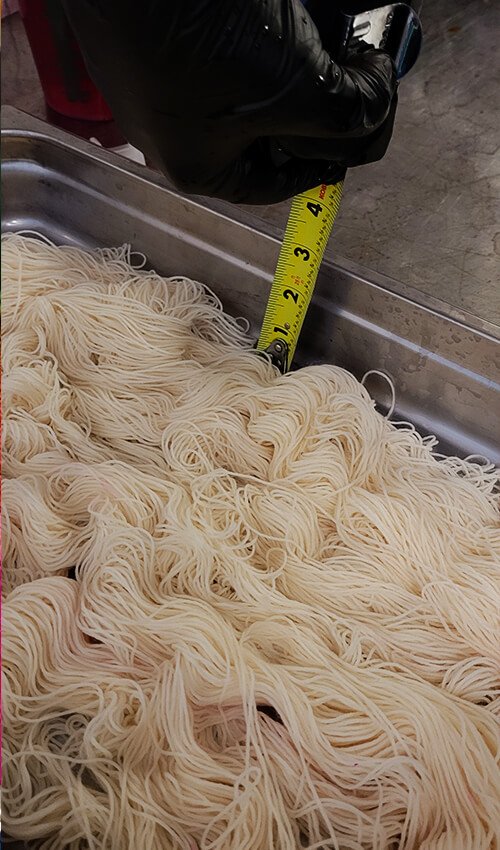
2.5 inch deep stainless steel tray (found in restaurant supply stores)
1000 milileter measuring cup
Acid Reactive Dye, colors used here are Hot Pink Washfast Acid from Prochem and dye, Flourescent Safety Orange, Fluorescent Lemon, Spearmint Breeze, Bright Aqua and Purple Pop from Dharma Trading Company. Feel free to substitute with whatever rainbow dyes you have from your favorite company.
A Jewelers scale that weighs fractions of a gram
A 60 ml luer lock syringe (easily found on Amazon)
Citric Acid (white vinegar can be substituted but is not recommended)
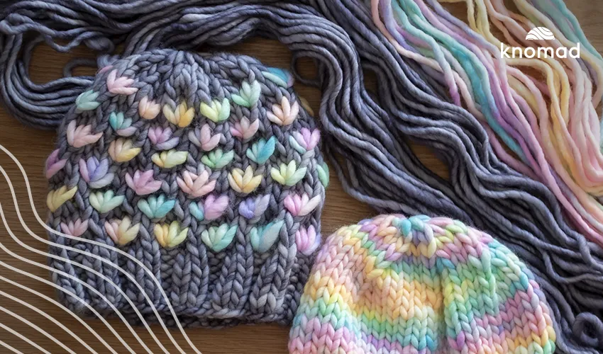
Your Favorite Knomad Yarn – 2 or 3 skeins per tray, no more no less
First step!
Fill a tray with 2 inches of water, 1 teaspoon of citric acid and a teaspoon of synthrapol soap
Carefully lay in 2 or 3 skeins of your favorite superwash base from Knomad, today I used Eggshell.
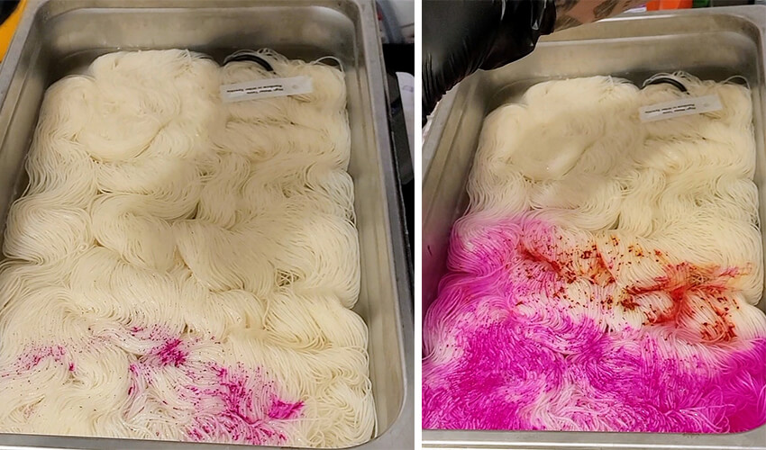
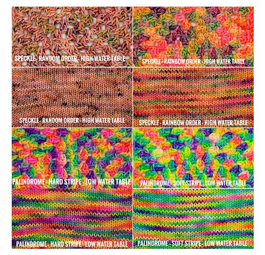
Random Rainbow Speckle over High Water Table
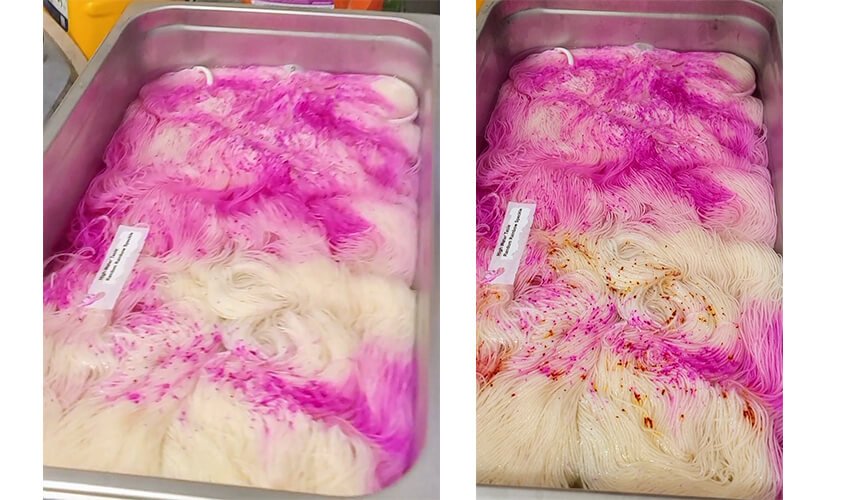
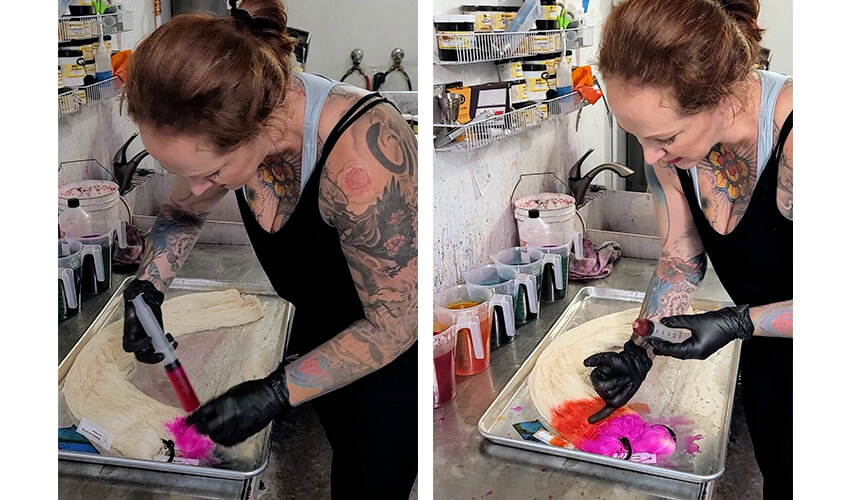
Take a tiny pinch of the Hot Pink dye and drop over the yarn in a random zig zag pattern. Make sure your yarn is very hot, just under a boil, so that the dye can strike as quickly as possible. If you speckle everything cold with this high of a water table, by the time it’s at the temperature needed to strike, it will have overmixed and you’ll have a mostly brown skein with zero speckles.
Next we drop in the orange dye, strategically placing it in the white spaces so we don’t get too much overmixing.
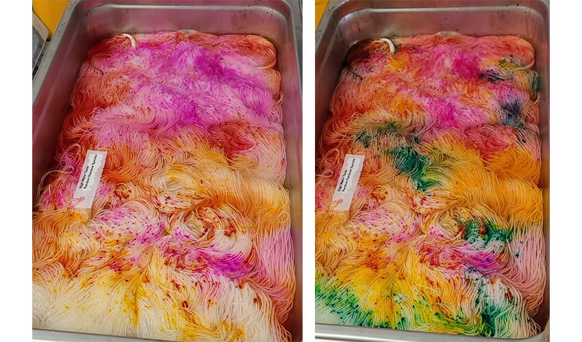
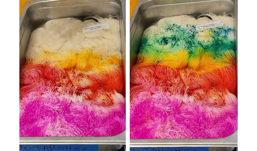
Now we go in with the yellow. Because yellow is such a weak color, we want to make sure not to put any green or blue over the top of it, because it is so easily influenced. Make sure to leave enough white space for the green, blue and purple dye! A good tip is to drop about ⅓ the amount of dye you actually want, to account for how much it “blooms” in this high of a water table.
Next we drop in the green. Because the mill type on this particular color is gritty and sandy, it creates a much cleaner “speckle” than the cakey, overly powdery yellow.
Because the pink is such a strong color, it has bloomed pretty far into the pan and left very little room for blue. Therefore, I dropped some blue over the pink to give us a nice purple underneath. I also dropped some blue over the yellow sections (just at the margin) for a bright chartreuse.
I dropped the purple last just at the margins of the pink and blue to tie everything together. Make sure to avoid putting any purple over the yellow or orange, unless you want a fall toned brown effect.
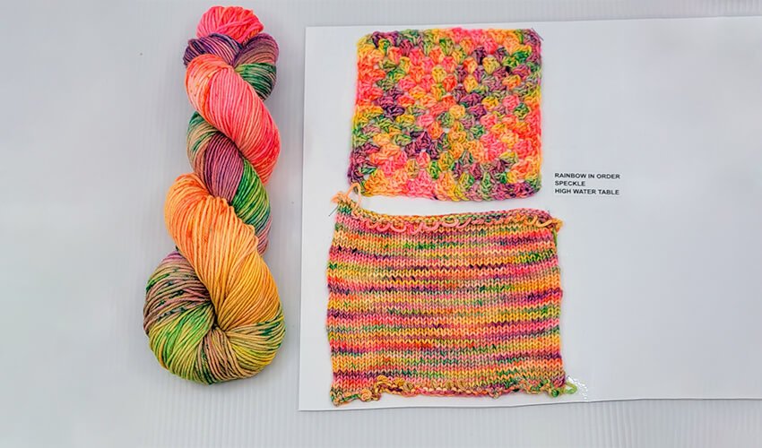
After about 22 minutes, all the dye was absorbed and I let it cool to room temperature before rinsing and drying. Let’s take a closer look at the dried yarn in it’s knit and crochet swatch!
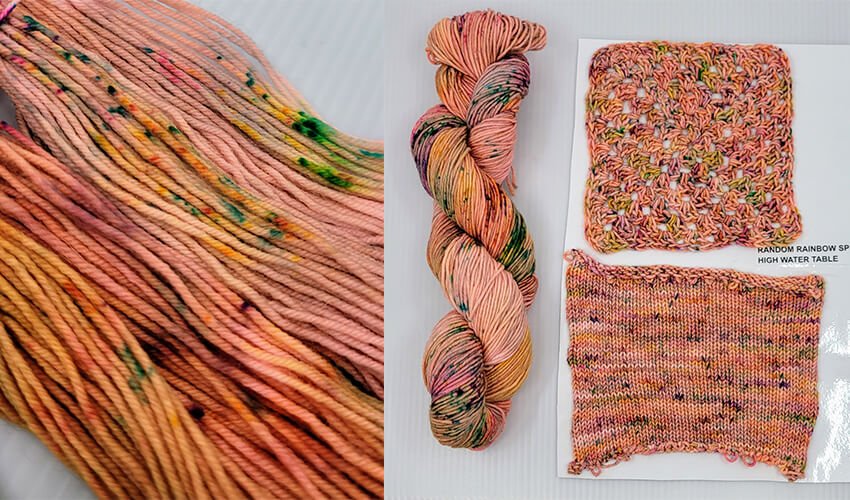
As you can see, the pink and orange migrated throughout the entire skein, giving us a nice peach background but there are still some crisp, distinct speckles.
Because of how warm the background color is, the purple disappeared and turned to a dark blue. The blue speckles have more of a teal appearance because there’s so much orange in the body of the skein. While the knit swatch leaves something to be desired, the crochet swatch does a better job of showing off the pops of color and grouping the speckles together. Random dye placement isn’t ideal for those who want a true rainbow skein though. Hence, our next technique!
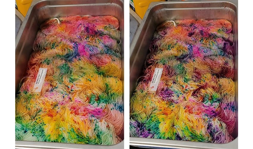
Just like we did before, except this time, we speckle the dye in rainbow order, starting with pink. This color is pretty saturated, so go in with a light hand or else we’ll have the pink overtake the whole pan!
Speckle in the orange. Try to go about an inch away from your desired placement with the understanding that the dye will “bloom” towards the previous color. Overlapping your speckles will usually cause them to blend together giving you a solid third of your skein pink/orange, which means your finished item won’t have equal rainbow representation but skew pink/orange.
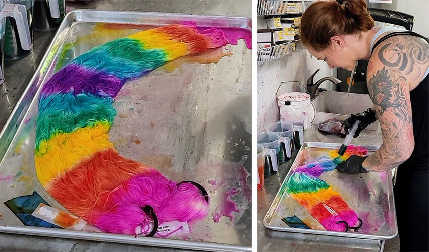
Speckle in the yellow, being careful to keep any other color from getting too close to it. It is what I like to refer to as “easily suggestible.” If the orange or green speckle section gets too close, the yellow disappears and you have a green section next to an orange section with brown in the middle. Not very rainbow-tastic.
Speckle in the blue
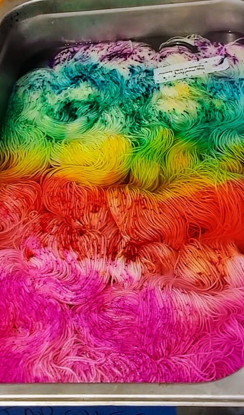
Speckle in the purple. Since this was already up to heat, the color should be absorbing pretty quickly. I never boil my yarn, but like to keep it at 200 degrees for 22 minutes.
Let’s take a look at how the color placement is affected by keeping the colors in order vs random placement!
The colors in this sample are definitely cleaner, brighter and more cohesive than in the random sample. Speckling on a high water table gives more of a “marbled” appearance than a true speckle. For crisp, unblended speckles I recommend a super low water table.
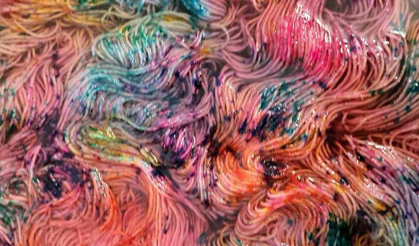
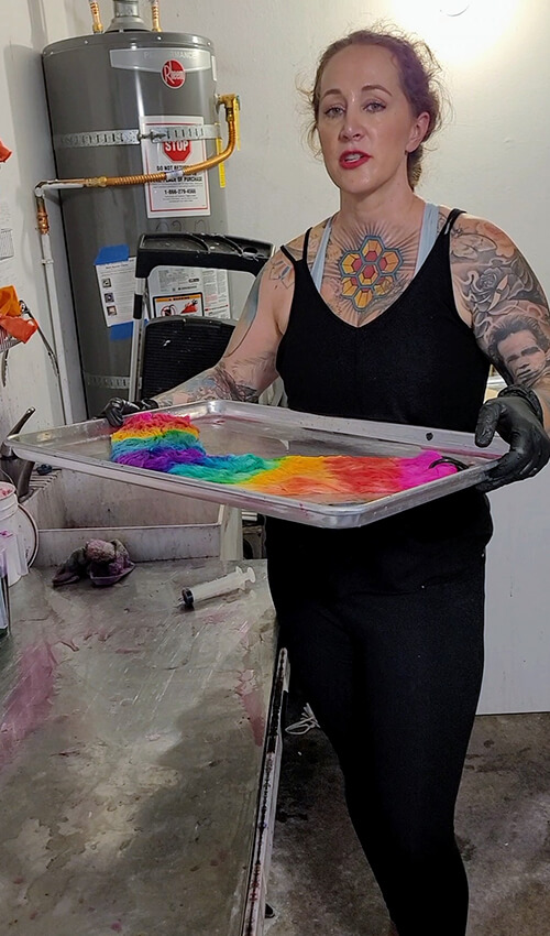
When I say “low water table” I mean damp yarn. The more water, the more the dye bleeds onto the strands around it and the more overmixing you get. But that’s a blog post for another day! Let’s look at Palindrome dye application with a hard stripe vs a soft stripe.
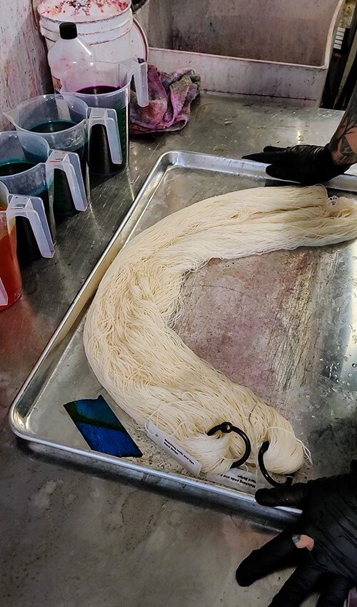
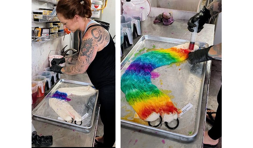
Start with damp yarn that’s been soaked for a few hours in synthrapol and citric acid. I like to use a bakers tray vs a smaller food tray so I can get maximum color placement control.
Mix your dye stock as follows:
2 grams dye, 1 teaspoon citric acid, 1000 mililiters of water for each color
Start with the pink dye at one end. We are going to be applying the dye in “palindrome” order. What’s a palindrome? It’s a word that’s spelled the same backwards and forwards, like WoW or MoM. We can apply that theory to dye color placement by applying the dye in such a way that the skein reads the same backwards and forwards.
Next pack in your orange. Make sure to place the dye about 3 finger widths away from the pink and work the dye towards the pink. If you place the orange at the line of demarcation of the pink, then it will over mix during the heat set and you’ll have an over-representation of color in the finished piece.
Make sure the purple is at the mid point to the skein.
Now we apply the blue, green, yellow, orange and pink in the opposite order so that the skein is a true “palindrome.”
Flip your skeins and dye the back side, otherwise you’ll have white patches interrupting the color flow when you go back to work with the yarn, and we don’t want that, do we?
Pop this in your oven, proofer, or steamer at temperature (200 degrees) for 30 minutes. Because there’s no water table with this yarn, you cannot put it on a burner or it will sizzle. Even though superwash is treated to be resistant to felting with heat and agitation, we definitely don’t want to sizzle our yarn and ruin it’s structural integrity. Plus, it feels kind of ropey and dead when it’s heat set in a microwave or over an open flame and boiled.
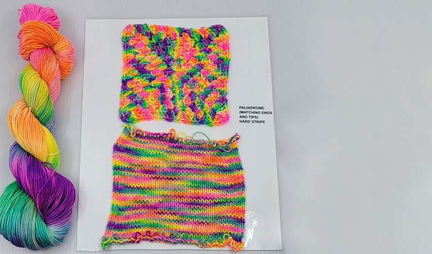
The hard stripe has given each section of the granny square (3 double crochet stitches) it’s own color! In the knit swatch, we’ve got some color pooling and a high degree of variegation. I love using a highly variegated yarn like this with tight color sequencing in a chevron, granny square or as the mosaic knitting foreground with a solid shade background.
Palindrome dye application on low water table – SOFT STRIPE
Now we’re going to repeat the same dye application, except with a softer transition at the edge of each color. This time, I started at the middle with purple just to show it can easily be done both ways.
So I start with pure purple. Then, I mix 50 ml of blue with 10 ml of purple pop, and put that at the edges of each side of the purple. Then I add just the blue to either side of that. Then I mix the green and the blue 30 ml/30ml (because the saturation point of spearmint breeze and bright aqua is the same) and so on and so forth until I get to my pink tipped ends. The point of doing a softer color transition is to create a more blended effect in the finished piece, where each color flows into the next instead of a hard jump.
As with the other skeins, heat set at 200 degrees in an oven, proofer or steamer for 30 minutes and cool to room temperature before rinsing.
Let’s look at how the blended edges influenced our swatches!
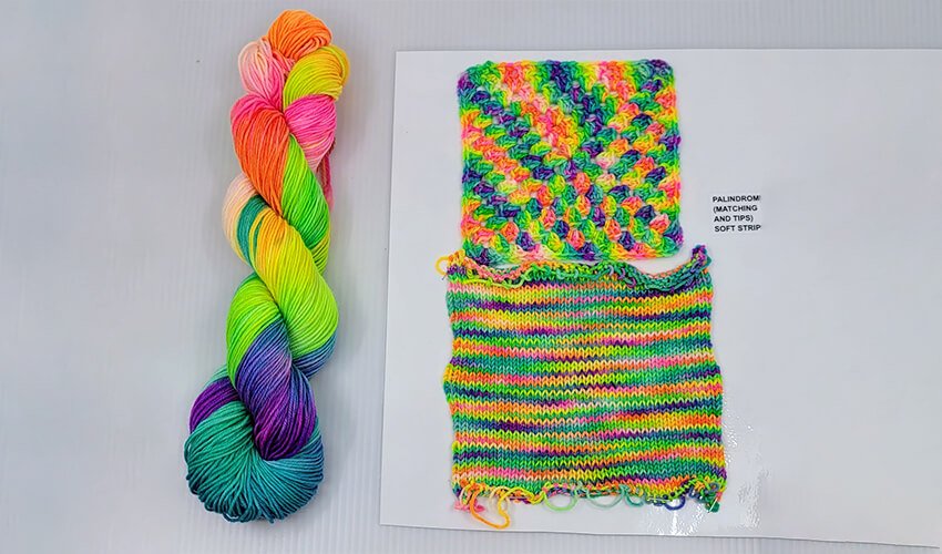
While each grouping of double crochets still maintains distinct colors, if you look closely you’ll see that most of the color groupings are actually 3 colors blending into each other! In the knit swatch, the pink/orange was minimized and the green/blue over represented. More intense pooling as well compared to the hard stripe.
Let’s look at the skeins next to each other. It’s incredible that these are all the identical dye colors at the identical saturation, and just tiny manipulations in how we handle the dye have enormous impacts on how the color works up in a given fabric.
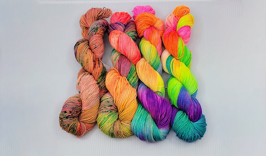
If we didn’t know better, we’d think a lot more colors were used than just a standard 6 color neon rainbow
I hope this helps you select the right water table and dye application style for your next project! Stay tuned for my next installment in August, where we learn about how to build a space gradient using resists and multiple process dye technique!