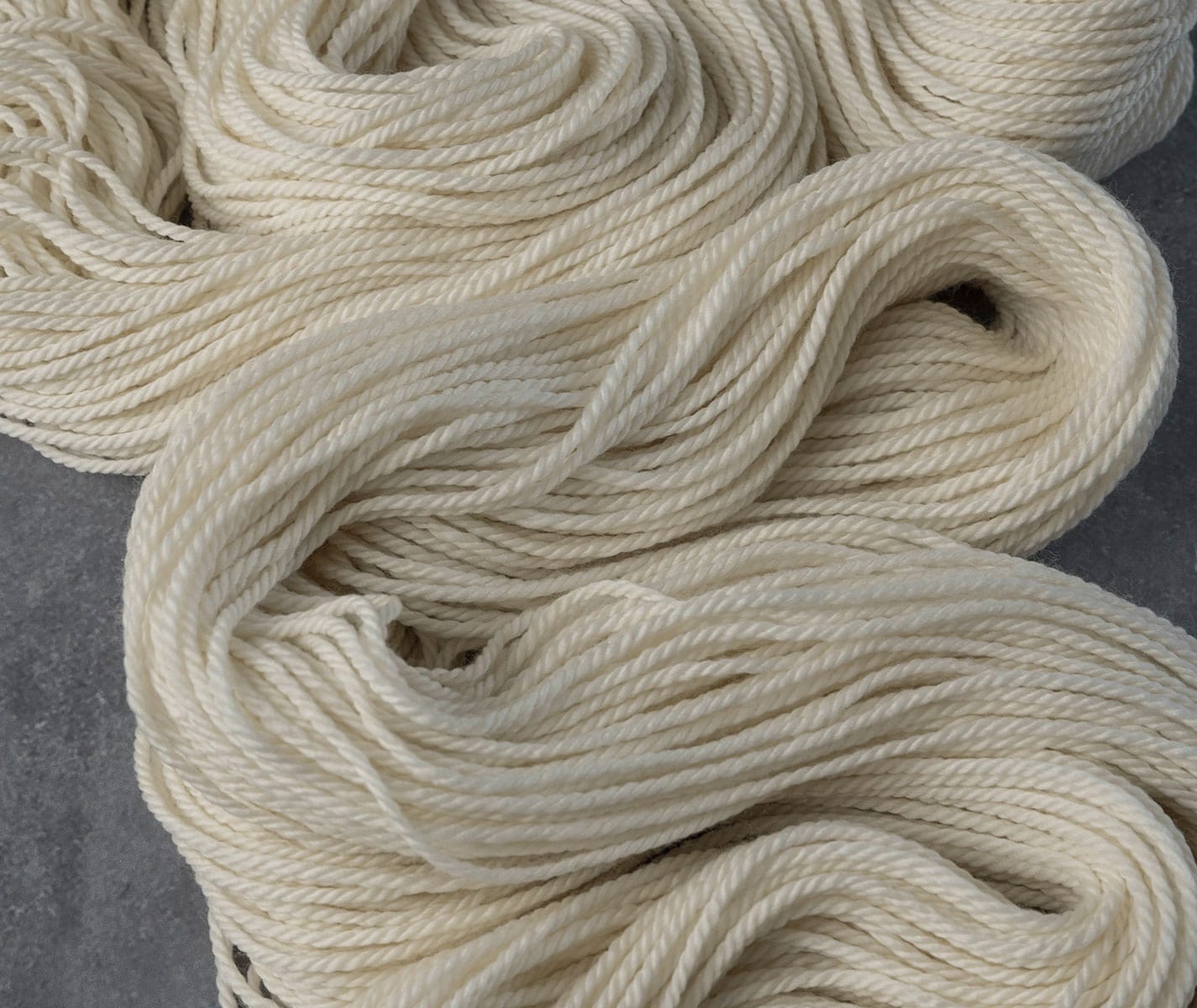
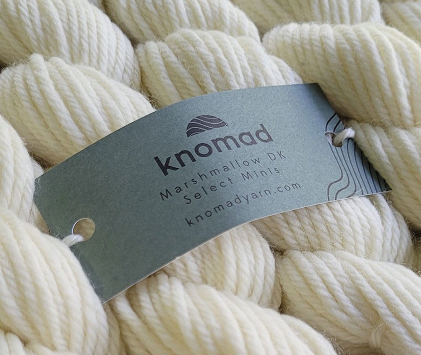
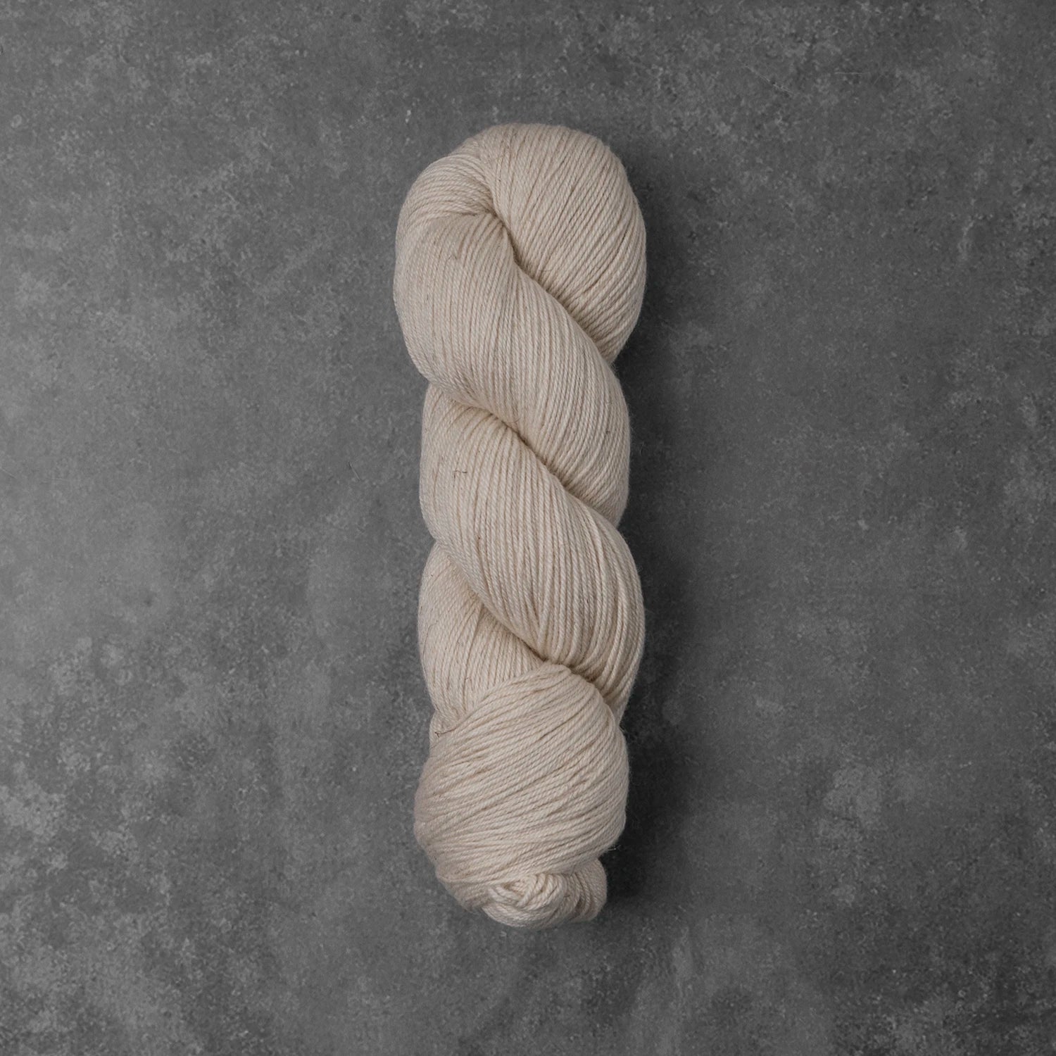
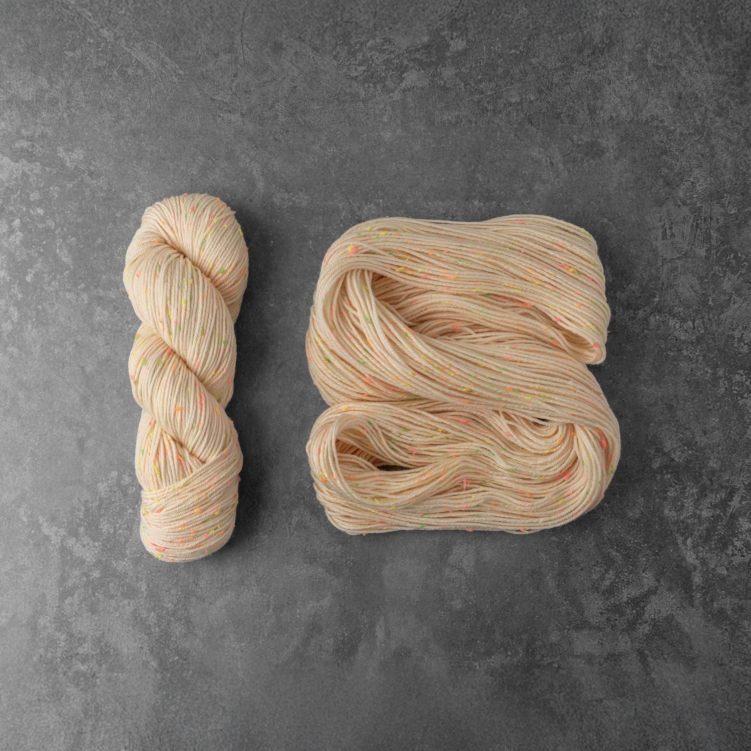
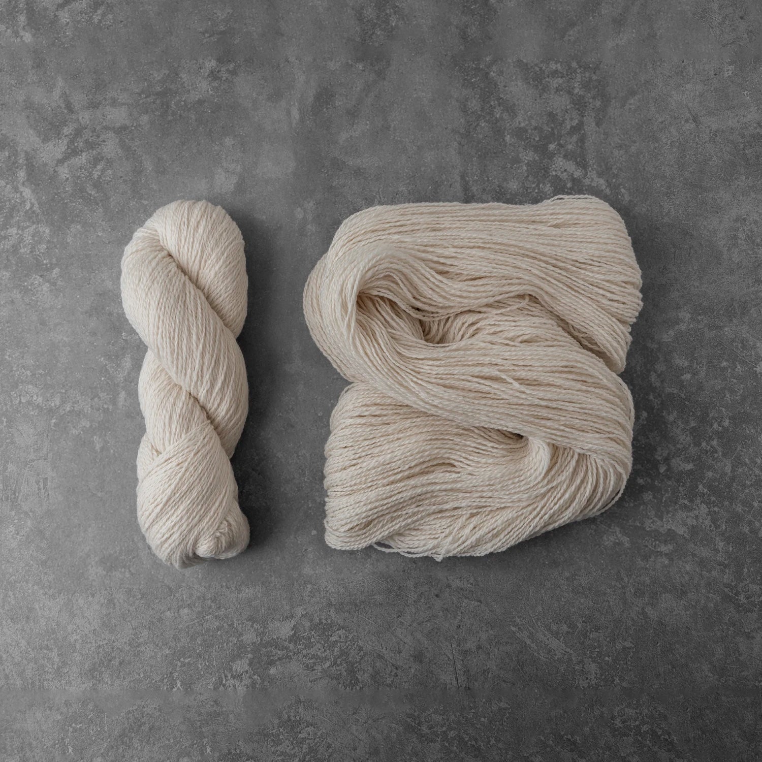
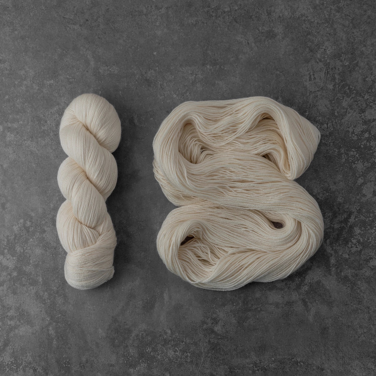
Featuring: Knomad Marshmallow DK 20 Gram Minis; 100% 21.5 Micron Superwash Merino
Our Goal: To test the new Jacquard blacklight blue and observe the saturation point for 3 fluorescent dyes so we can build a balanced triad dye study in Part 2.
Abstract: There’s a new blacklight reactive blue on the market (a first) so we’re going to build a 66-color triad dye study from a fluorescent pink, yellow and blue. But to make sure that it’s “balanced”, we need to find the saturation point for each color that matches optically. Otherwise, the most saturated color will overtake our whole study and we won’t get to see the balanced interplay of possible hues.
For those with time to read the finer details, let’s dive in!
-33 Marshmallow DK mini skeins
– 1 ml syringe
-10 ml syringe
-Gloves
-Respirator
-Double Burner Induction Cooktop
-33 Glass Pint Jars
-Acid-Reactive Dye from Pro Chem Washfast acid in Hot Pink, Flavine Yellow and Jacquard Blacklight Blue
-Laminated jar tags and string to tie them on with
-8” deep stainless steel restaurant tray
-Citric Acid
-Gram Scale
-Synthrapol textile detergent
Fill an 8” deep tray with 2 gallons of warm water and 1 tsp of Synthrapol. Carefully untwist the minis and lay them across in a straight line so they can be easily picked out without tangling. Let the minis soak overnight so they’re thoroughly wet.
While the minis are soaking, laminate a page with the following dye concentrations on it, hole punch and attach to your dye jar. This is how we will be keeping track of our percentages.
Hot Pink .05% | Hot Pink .10% | Hot Pink .20% | Hot Pink .30% | Hot Pink .40% | Hot Pink .50% | Hot Pink .75% | Hot Pink 1% | Hot Pink 1.25% | Hot Pink 1.5% | Hot Pink 2%
Make sure to Make the same tags for the yellow and blue.
Next, we mix our dye stock. The recipe is 10 grams of dye powder in 1000 ml of water.
Make sure the dye stock is well dissolved and there’s no “dye scum” around the rim or sediment settled at the bottom. Use an immersion blender if your dye separates. If you have ground water or well water, or otherwise know your tap water interferes with the bind of the dye, use distilled water for your experiment.
I used my fingers and hot water to rub the dye particles that stuck to the edge of the measuring cup so that the dye stock could be measured as accurately as possible.
Now we’re ready to start adding dye stock to jars! Since 10 grams of dye is dissolved in 1000 ml of water, we can measure the tiny fractions of a gram far more accurately (and quickly) with syringes rather than dye powder, which is so small most gram scales won’t be accurate enough.
Degree of Strength = grams of dye powder per grams of yarn
Skein Weight: 20 grams
Dye Stock Strength: 1% (meaning 100ml of stock contain 1 gram of dye)
Degree of Strength: Ratio of weight of dye per weight of yarn
Milliliters of dye stock needed to achieve a desired degree of strength:
(Skein Weight * Desired Degree of Strength) * 100ml
EXAMPLE: 0.5% Degree of Strength
Skein Weight: 20 grams
Desired Degree of Strength: 0.5% = 0.5/100 = 0.005
(20 * 0.005) * 100ml = 0.1 * 100ml = 10ml
If the math isn’t “mathing” for you, just follow along with this dye chart:
Degree of Strength | Amount of Dye Stock |
0.05% | 1ml |
0.10% | 2ml |
0.20% | 4ml |
0.30% | 6ml |
0.40% | 8ml |
0.50% | 10ml |
0.75% | 15ml |
1% | 20ml |
1.25% | 25ml |
1.50% | 30ml |
2% | 40ml |
Measure out 1 Tablespoon citric acid in 1000 ML of hot water and distribute the citric acid water evenly among the 11 jars. Measure in your dye stock and fill ¾ of the way to the top with water.
Now we’re ready to add the skeins into the dye jars. I like to dunk each one a few times so there’s no “crinkled” spots on the skein that resist the dye and end up white.
Fill an 8” deep stainless steel tray with 18 pint jars and fill the tray up with hot water to within an inch of the top. Put on an induction burner for 45 minutes at 300 degrees, and let cool to room temperature.
The blue and the yellow dye exhaust to clear, but hot pink leaves a tint to the water the higher the dye concentration. This is normal behavior for this color and doesn’t mean you did anything wrong.
Rinse your yarn out one skein at a time, and make sure to tie each jar tag onto the skein so we can keep our percentages straight.
I like to mount my dye swatches on embroidery floss bobbins and store them in coin collector pouches in a binder. You can also create an “at a glance” live edge page like this that’s smaller and more portable.
Now we get to compare the 3 colors at 11 saturation points and figure out which ones are the closest in color value (the depth of shade) that will yield a balanced triad study.
You may be wondering if this is a necessary step, and I’m here to tell you it is. My first triad study, back in 2019, was a 3% d.o.s. study featuring Pro Chem Washfast Acid in Rhodamine Red, Flavine Yellow and Turquoise. I had to take a still shot from the video to show how unbalanced it turned out.
See the full video here
The turquoise dye was so incredibly pigmented it overpowered all the internal colors and turned them some shade of green! Dye is not like paint, in that the primaries are all the same saturation point. A color study is necessary to dial in the saturation point of each color individually so no one color overpowers another.
Here’s our results:
Let’s break that down into the palest shade set to the deepest for a closer comparison
As we can see, the palest concentration (.05% d.o.s.) is clearly pink, clearly yellow, but the blue is so pale it looks white. Even if you compare the .20% blue to the .05% pink, you can see that the blue is naturally not a pigmented color.
Here’s our left- middle values, the pink looks pretty consistent between .3 to .5%, the yellow has some more obvious saturation jumps, and the blue remains both consistent and significantly paler than the other 2 shades. Our balanced colors are not in this set.
Here in our right – middle values, we see the pink getting stronger, yellow remaining optically consistent despite the dye saturation going up, and we start to see some more pigment in the blue. Our balanced colors are not in this set either.
Here’s our most saturated values, 1.5 and 2%. If we only focused on the most saturated colors, I think a case could be made for doing the triad with each color at 2%. But it would turn out heavily yellow-focused, since the flavine yellow is clearly the most pigmented color, pink somewhat less and the blue significantly less, about half in fact.
Here are the colors that I see as closest in saturation to each other:
I think this photo clearly depicts the saturation point differences for all 3 colors.
Let’s look at them close up – can you see that these 3 colors look balanced and visually have the same color strength?
For those of you that like making colorways meant to be viewed under blacklight, here’s our color study comparison under a UV bulb.
Notice how the pink and yellow clearly fluoresce pink and yellow, and that the increasing saturation point shows under blacklight? Notice how the “blue” remains consistent regardless of how much dye powder was used and fluoresces very little compared to the other two colors? My personal opinion is that this is not a truly blue fluorescent dye pigment, but a small amount of blue dye put into an optical brightening powder of some sort. To the naked eye, while photographing this, it doesn’t even glow blue, but white.
I hope you found this tutorial enlightening, and that you’re ready for part 2: the formula for a 66-color triad featuring 3 fluorescent colors! Here’s your sneak peek for what we will learn next time!
This was so interesting!!
Hi Nicole. I love your articles and the way you explain the processes. I particularly love the article “ TRIAD DYEING PART 1: FINDING THE CORRECT SATURATION POINT FOR OUR 3 COLORS” because I have been disappointed in the past when one color takes over a blend.
The 3 saturations that you chose that seemingly looked the same saturation don’t look the same at all in grey scale, however. In fact they are 3 different saturations. I usually use the grayscale to combine dyed yarns for weaving and thought this would work to choose like saturations in dyeing as well. What are your thoughts?
Hi Nicole. I love your articles and the way you explain the processes. I particularly love the first article on triad dyeing . I have been disappointed in the past when one color takes over a blend.
The 3 saturations that you chose that seemingly looked the same saturation don’t look the same at all in grey scale, however. In fact they are 3 different saturations. I usually use the grayscale to combine dyed yarns for weaving and thought this would work to choose like saturations in dyeing as well. What are your thoughts?